We are pleased to announce the release of version 1.3 with one important new functionality: Charts!! You can plot functions or data (X, Y) list.
Main Screen
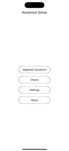
The Main Screen is updated by adding one new button, Charts. When you tap on this button you go to the main page of the Charts module:
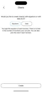
In the main page of the Chart module you select if you want to plot functions (or equations as you see in the screenshot) or data. By default the functions option is selected. Then, you tap on the Create button at the bottom of the screen to go to the next page for creating a chart.
Plotting Functions
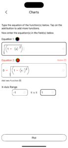
The functions have the y=f(x), so y is a function of x. Here, the equality part is missing, and all that we see is the part of the f(x), i.e. the equation. Since, there is only one variable, x, you are not asked to enter the variables, and you see the section for typing the equation.
In our example, we want to plot the equations of the circle, e.g. x2+y2=r2. Now, we will solve this equation for y, and set the radius, r to be 1. Thus, we get:
y=(1-x2)1/2 and y=-(1-x2)1/2.
The value of the variable x is in the range of -1, 1.
Did you notice the black circle next to the name of the equation? If you tap on it, you can change the color of the function. For the 2nd second, we have chosen the red color for the function.
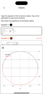
Finally, we tap on the Plot button, at the bottom of the screen, and we get the 2nd screenshot.
Plotting Data (X,Y)
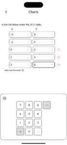
Here you are asked to enter the data in X,Y list, as you see in the screenshot:
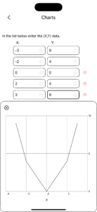
If you tap on the button “Add new Entry” (it is a typo, and we will fix it in the next version), you add a new entry. There is no limit in the number of entries that you can add. At the right end of each entry you see the “–” button. This is for deleting an entry. When you are done entering your data, tap on the Plot button to plot them:
It does not look like the quadratic equation, but then again, we used only 5 points!
